RTK
About
| Project |
| Brand: RTK |
| Client: RTK Group |
| Year: 2025 |
| Industry: Technology |
| Location: UK |
| Deliverables | ||||||
| Brand Positioning | ||||||
| Visual Identity | ||||||
| UX/UI Design | ||||||
|
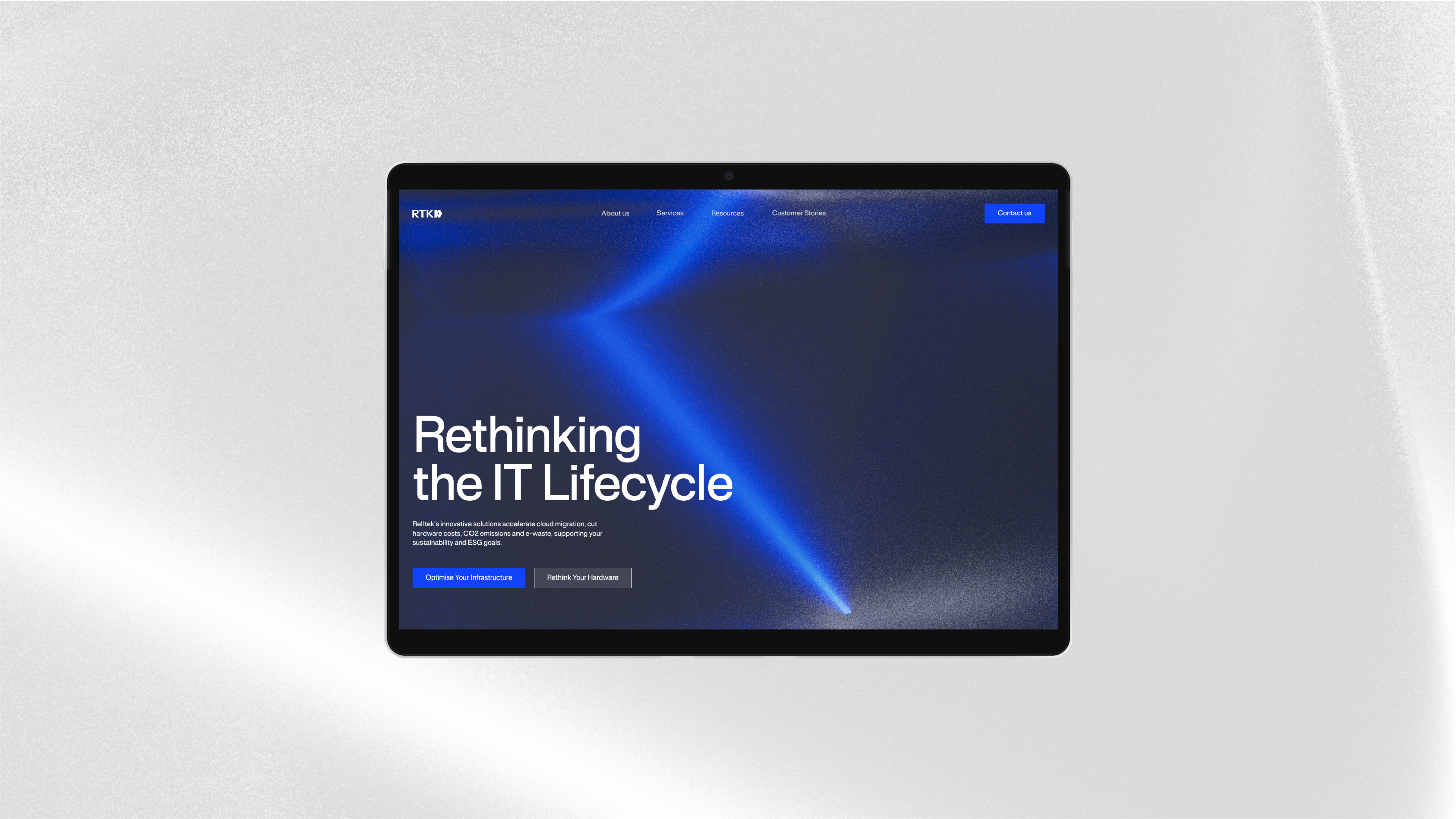
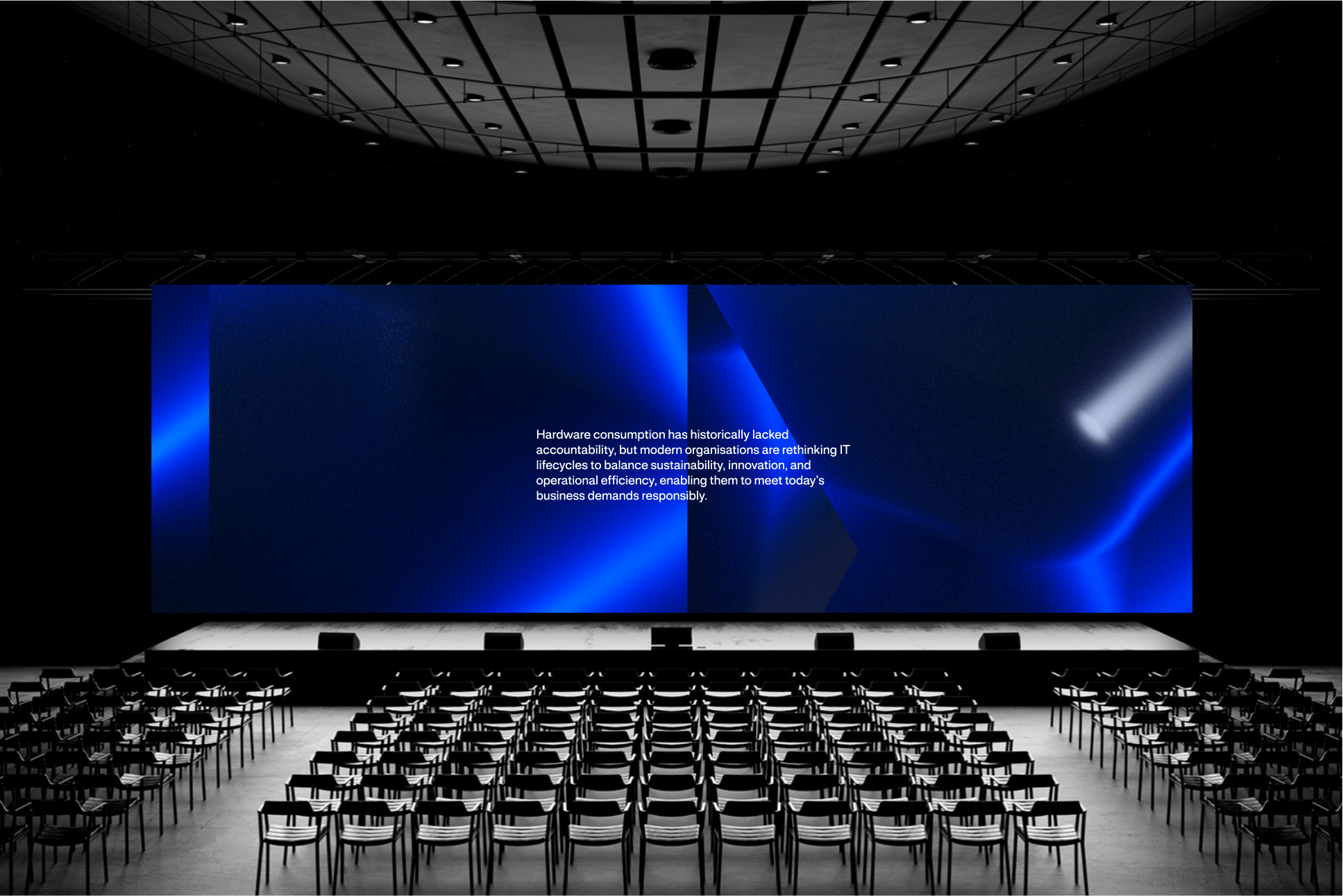
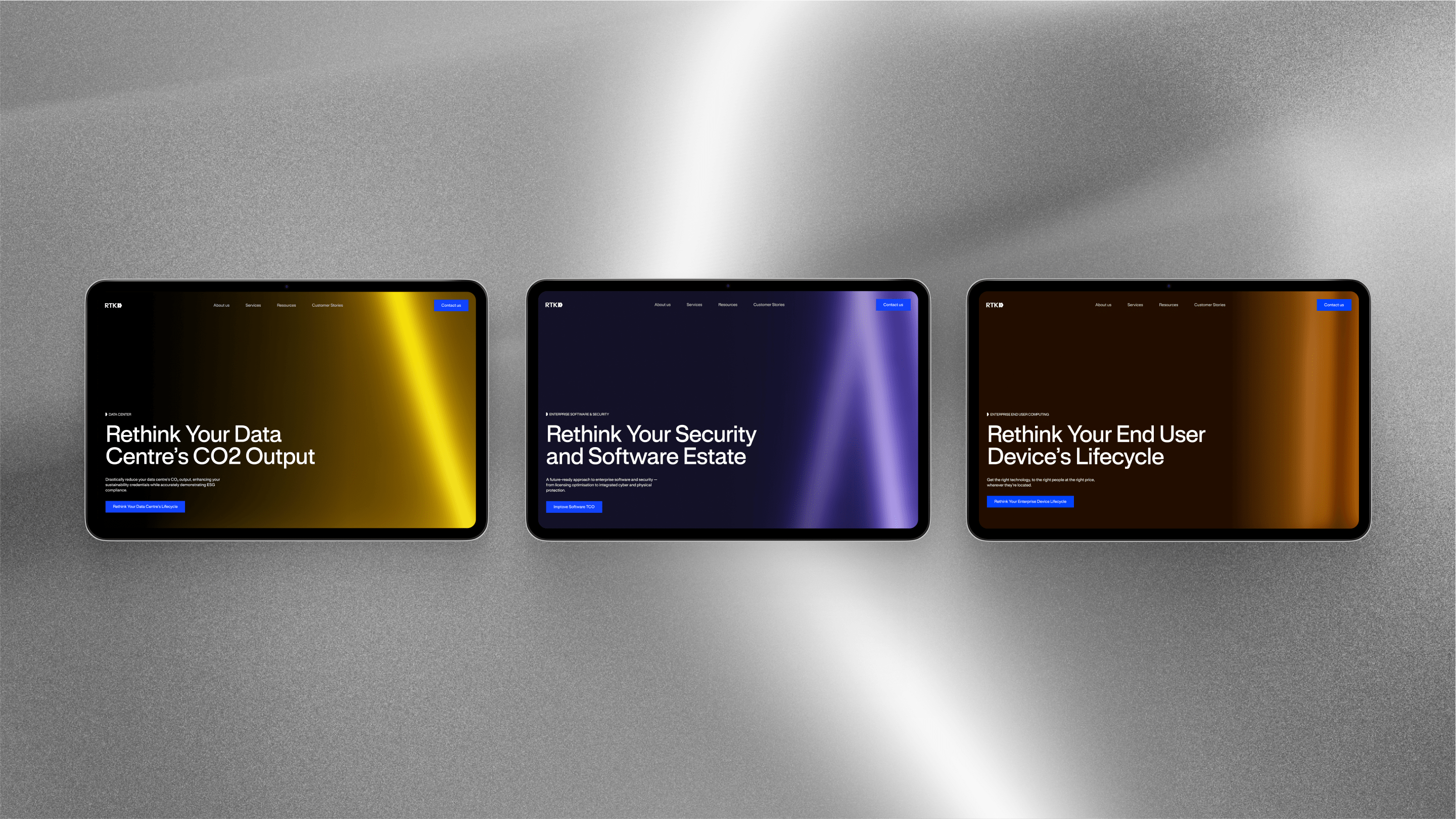
RTK is an IT company offering comprehensive solutions in the hardware area, including modernizing data centers, improving their security and reducing e-waste during the cloud migration process. Brand values was nowhere reflected by its visual identity, which was lost in an excess of random, characterless elements.
Rethinking. Reimagine. Recreate. Resolve. Rebuild.
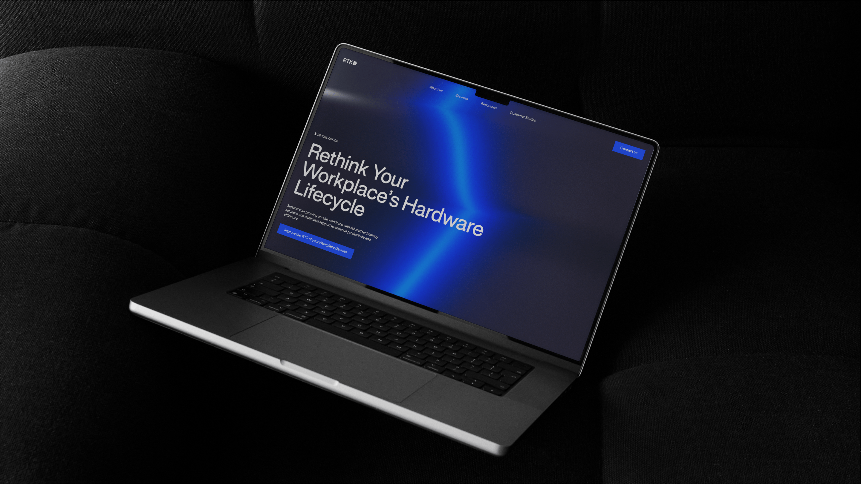
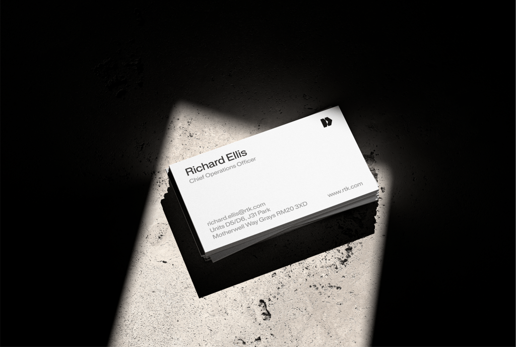
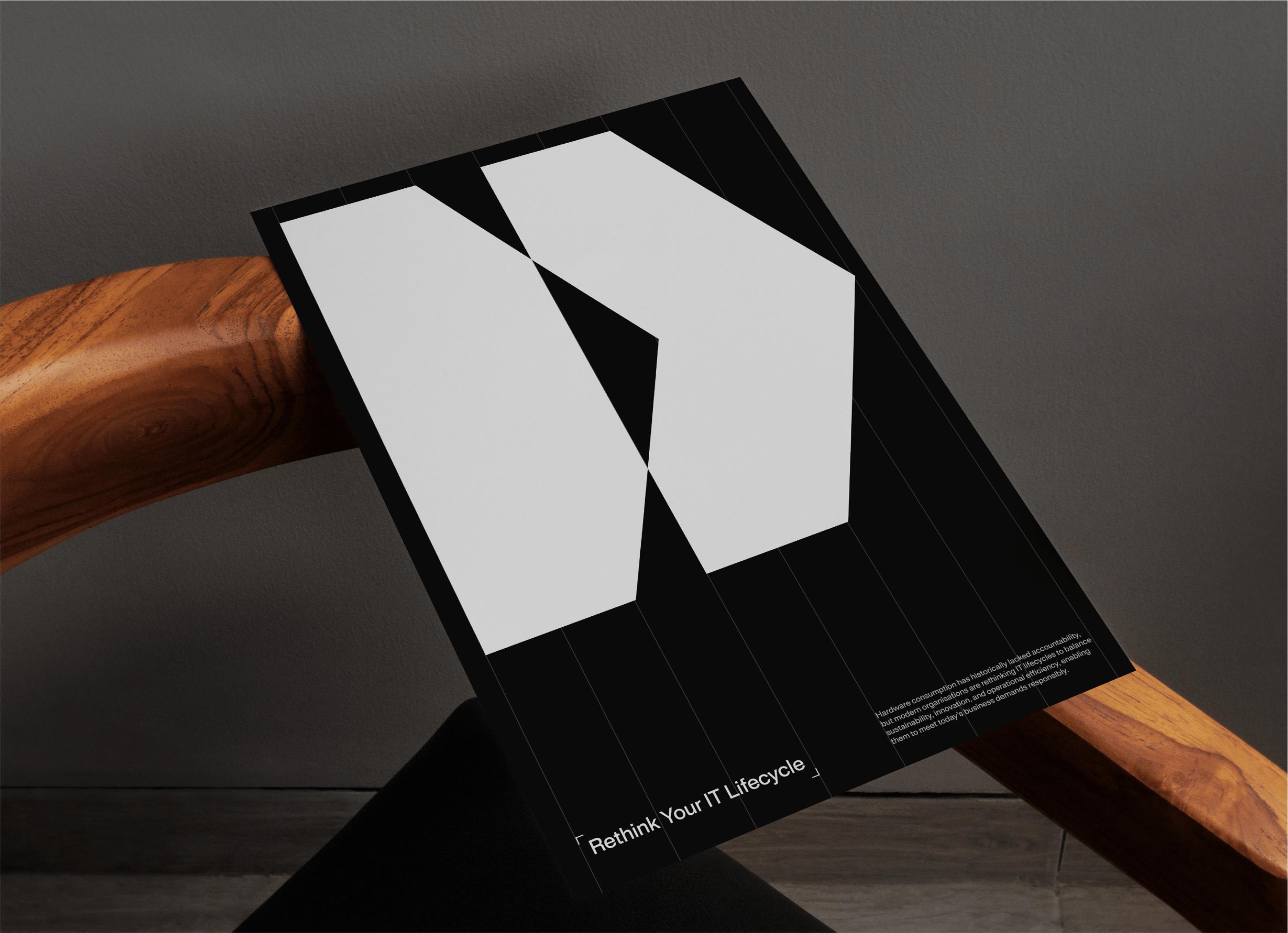
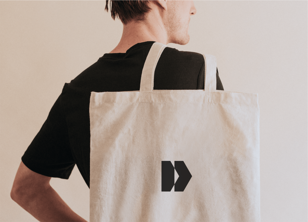
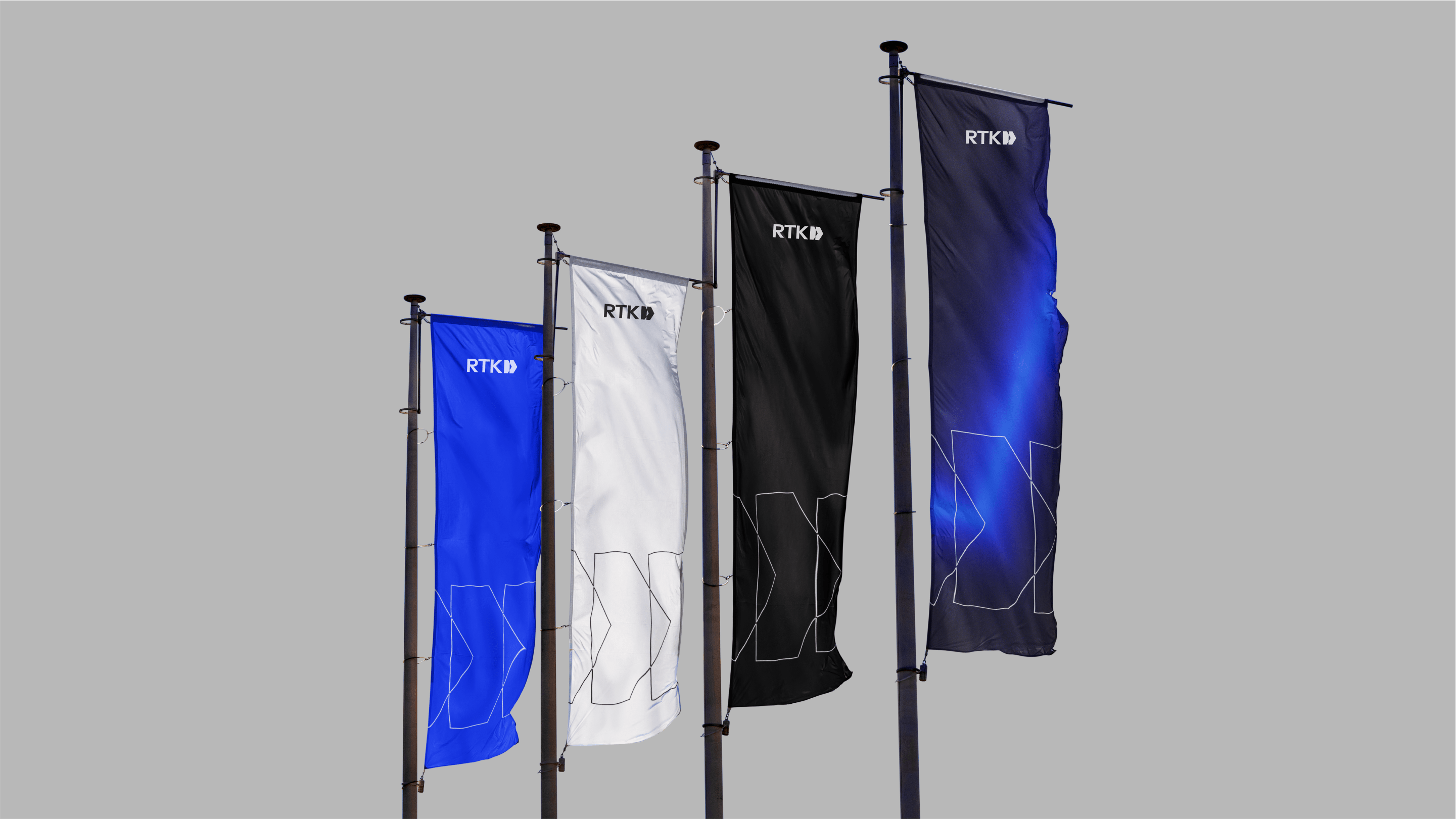
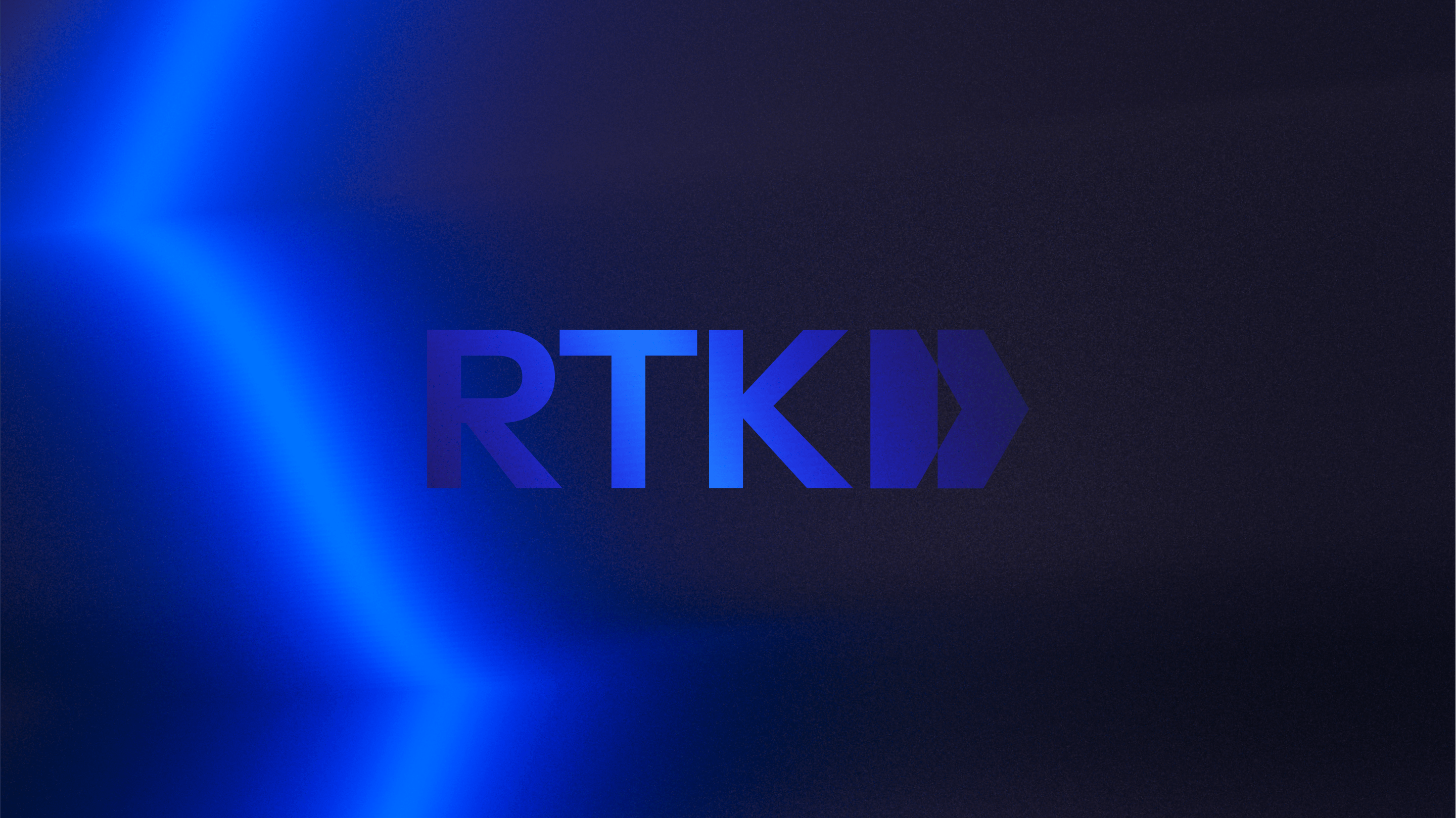
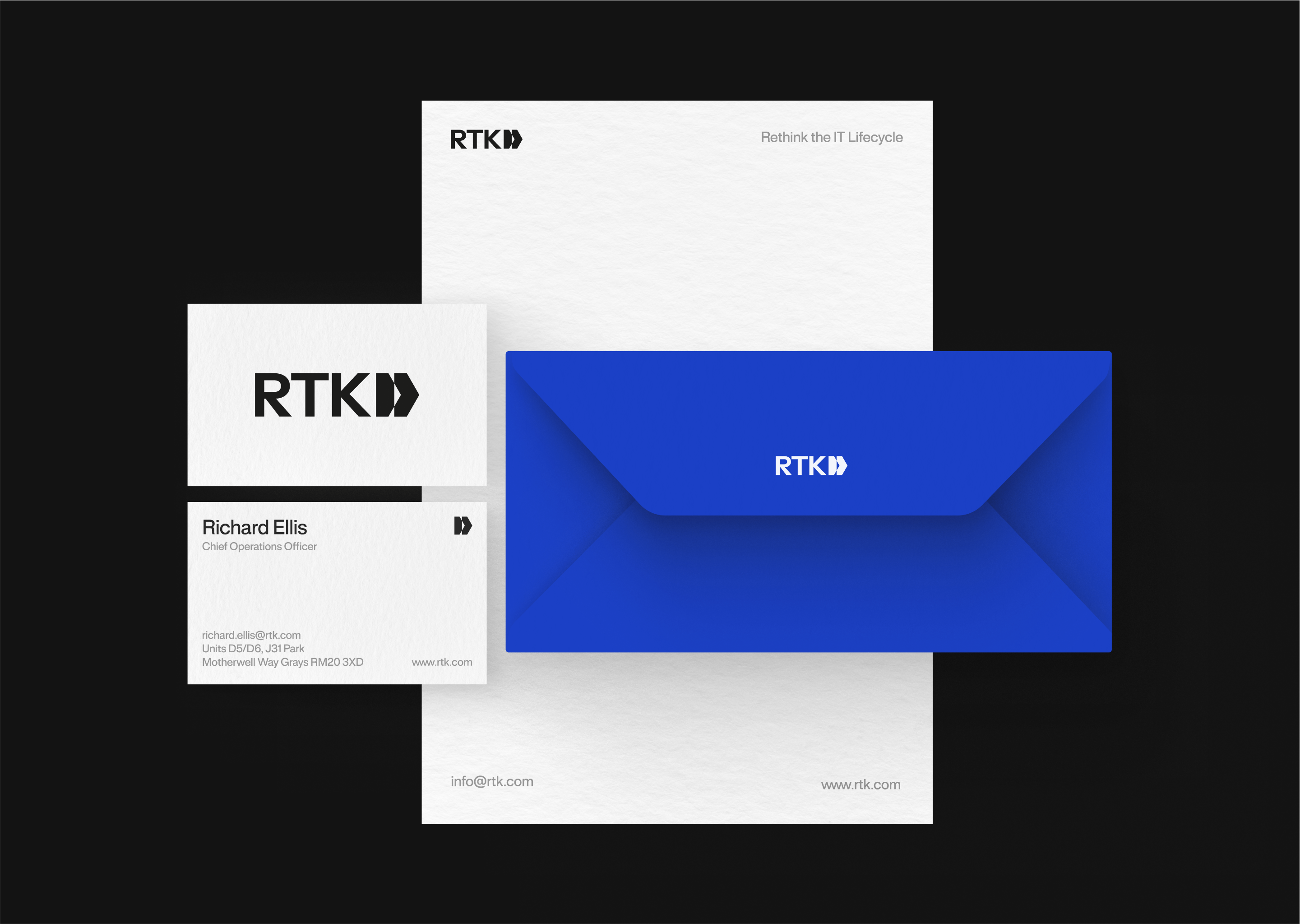
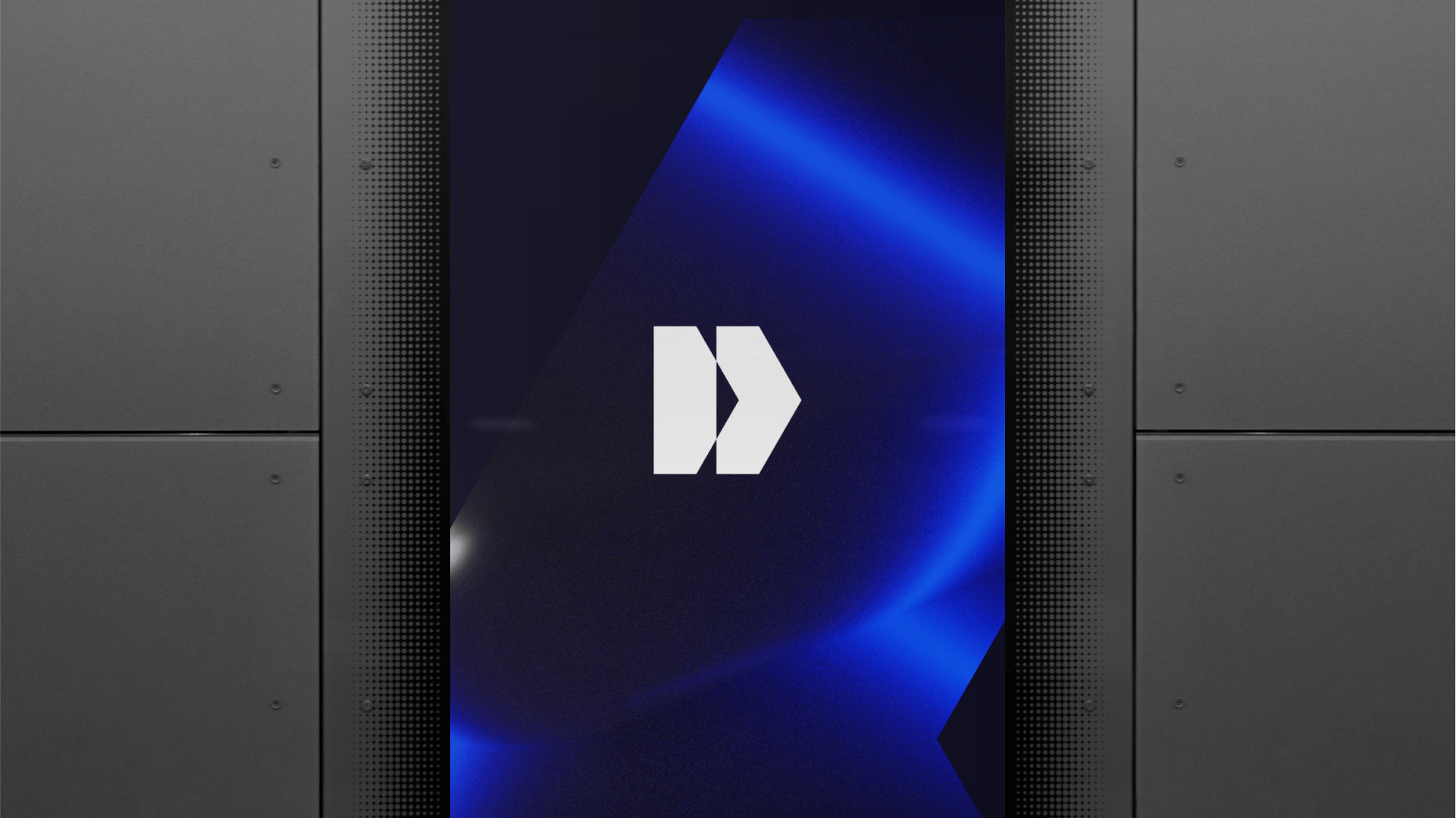
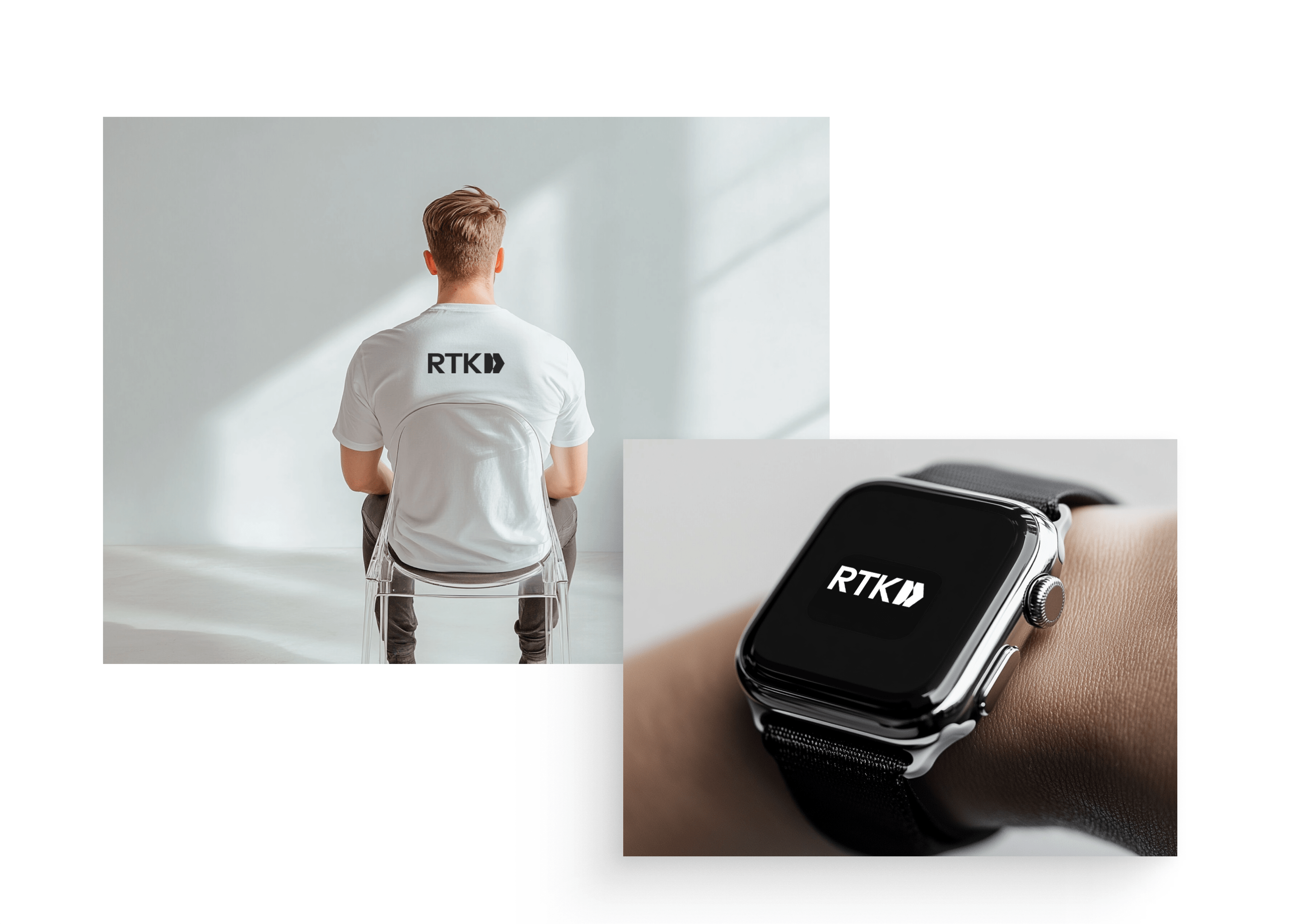
The basis of RTK’s new identity finally became a duplicated arrow, which is the brand’s signet, the shape of which we obtained by cutting a regular hexagon – a hexagon, in half. In doing so, we responded to the client’s need, while creating a flexible, scalable, element, later used as a photo mask, icon, bullet point and ornament.
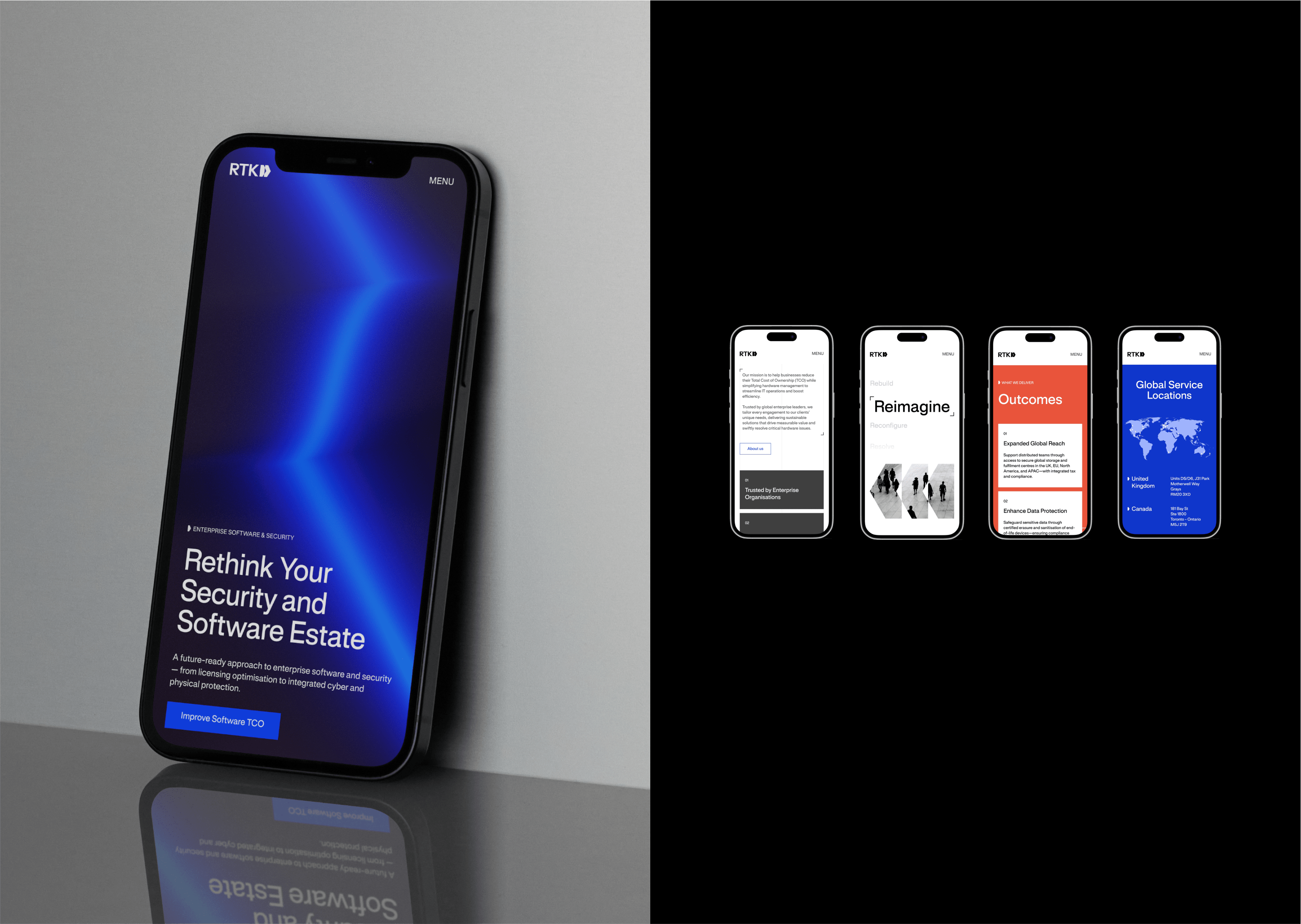
To emphasize RTK’s precision, we enclosed part of the text in technical brackets and organized the whole thing using vertical lines grid. For a better overview of the company’s services, we applied color coding to the three main solutions.